Building
Design Systems : DealBerg
Building
Design Systems : DealBerg

DealBerg is a B2B procurement platform designed to streamline the purchasing process for large enterprises. It connects businesses with trusted vendors to fulfill both recurring and one-time procurement needs efficiently.
The system is built around three core products to ensure a seamless workflow from order placement to final delivery:
Customer Portal : A catalog-based interface where clients can browse, select, and place orders for required products.
Vendor Panel : Enables vendors to view available orders, accept them based on capacity, initiate production, and manage deliveries.
Admin Panel : Used by Account Managers to oversee and coordinate large-scale, recurring bulk orders and ensure smooth operations across the platform.
The business model caters to three distinct user groups, each with its own set of user journeys and functional requirements. This complexity called for a unified design language — one that is unique to DealBerg, adaptable across all three platforms, and scalable for future client onboarding. The goal was to create a cohesive experience that not only complements the brand’s identity but also remains aligned with its core values.
Due to time constraints, the foundational design process moved swiftly from research and wireframes to low-fidelity and high-fidelity designs. This rapid progression highlighted the need for a robust design system — one that could ensure visual and functional consistency across all platforms, accelerate development efforts, and establish a distinctive and cohesive brand identity for DealBerg.
Alright, let’s dive right into the good stuff — the design system.
To begin with, the design system includes foundational tokens such as color, typography, spacing, and radius — the essential building blocks needed at this stage. Both color and typography tokens are further organized into semantic and component-specific categories, ensuring clarity in use cases and purpose-driven application across the platform.
To begin with, the design system includes foundational tokens such as color, typography, spacing, and radius — the essential building blocks needed at this stage. Both color and typography tokens are further organized into semantic and component-specific categories, ensuring clarity in use cases and purpose-driven application across the platform.
Since the end users of the three platforms operate in varied environments — such as offices, warehouses, and manufacturing units — the ambient lighting conditions differ significantly. This made it crucial to consider visual accessibility in each context while designing the UI. Understanding how users perceive screens in contrasting light settings helped guide decisions around color, contrast, and overall legibility.
Since the end users of the three platforms operate in varied environments — such as offices, warehouses, and manufacturing units — the ambient lighting conditions differ significantly. This made it crucial to consider visual accessibility in each context while designing the UI. Understanding how users perceive screens in contrasting light settings helped guide decisions around color, contrast, and overall legibility.
Colour
The primary brand color, a vibrant red-orange, was used selectively — reserved for elements that required subtle emphasis or attention, ensuring it didn’t overwhelm the interface. For core interactive elements like primary buttons, key CTAs, and essential text, black was chosen. Its high contrast and neutrality offered a sleek, modern look while maintaining excellent visibility across diverse environments, from well-lit offices to dimly lit warehouses and manufacturing floors.
The primary brand color, a vibrant red-orange, was used selectively — reserved for elements that required subtle emphasis or attention, ensuring it didn’t overwhelm the interface. For core interactive elements like primary buttons, key CTAs, and essential text, black was chosen. Its high contrast and neutrality offered a sleek, modern look while maintaining excellent visibility across diverse environments, from well-lit offices to dimly lit warehouses and manufacturing floors.

Typography
As a startup B2B platform entering a competitive market, DealBerg needs to build trust while onboarding clients—in a way that feels professional yet warm and human. The typography plays a subtle but critical role in shaping that first impression. That’s where Jost can shine.
1. Friendly Without Being Casual
Unlike very corporate or sterile fonts (like Arial or Helvetica), Jost feels approachable without being too playful. That balance is key for many B2B brands trying to:
-Build trust with new users
-Feel accessible and human
-Avoid sounding too "enterprise and robotic"
2. Stand Out in a Sea of Inter & Roboto
Let’s be honest—most B2B websites look the same. Inter and Roboto dominate the landscape. Choosing Jost gives your platform a visually fresh identity that still feels trustworthy and design-conscious. It helps DealBerg stand out without looking experimental or off-brand.
3. Space-Savvy, Surprisingly Efficient
While many highly readable fonts are round-shaped and tend to take up more space, Jost strikes a balance. It remains open and readable, yet compact enough to work within layout constraints. After testing different fonts, Jost proved effective in differentiating blocks of content while still fitting comfortably within responsive breakpoints—crucial for a content-rich platform like DealBerg.

Semantic Token
Semantic typography tokens - D2 and D4 are mapped to the brand’s core type styles. However, these tokens are flexible and can be adapted based on the onboarded client's brand personality when building their custom portal or adding a new token to the existing ones.
For instance, when onboarding UNIBIC, a cookie brand showcasing gift hamper solutions, we added the more formal Stevens Titling with the playful Insaniburger font. This shift align the portal's tone with UNIBIC’s fun and approachable brand identity while still preserving consistency in structure through semantic tokens.
Semantic Token
Semantic typography tokens - D2 and D4 are mapped to the brand’s core type styles. However, these tokens are flexible and can be adapted based on the onboarded client's brand personality when building their custom portal.
For instance, when onboarding UNIBIC, a cookie brand showcasing gift hamper solutions, we replaced the more formal Stevens Titling with the playful Insaniburger font. This shift helped align the portal's tone with UNIBIC’s fun and approachable brand identity while still preserving consistency in structure through semantic tokens.

Component Specific Token
Component-specific typography tokens were implemented exclusively for the Customer Portal, as its design required more flexibility and detail. In contrast, the Vendor Panel and Admin Panel follow a different design approach primarily focused on order history and trackpad-based navigation.
These two products maintain a more functional layout and therefore utilize typography only up to the semantic token level. This aligns with standard practices in most B2B platforms, where type systems typically do not extend beyond primitive and semantic tokens.

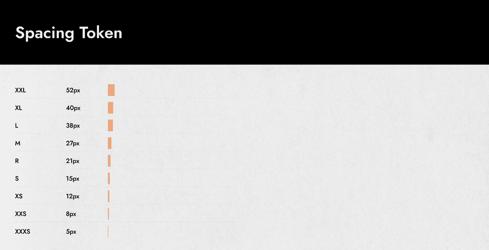
Spacing Token
Radius Token

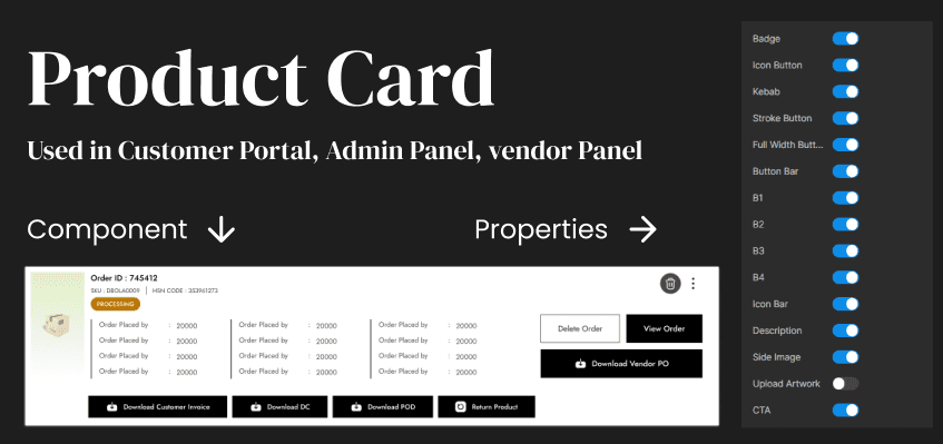
Component Library
Based on the established design system, a comprehensive component library was built and shared across all three platforms - Customer Portal, Vendor Panel, and Admin Panel. To ensure consistency across different pages and workflows, each component was designed with multiple properties and variants, allowing them to adapt seamlessly to a variety of use cases and wireframe scenarios.
Below are a few examples of components developed for these platforms: